Alezey
film poster analysis
Blade Runner -
The Blade Runner mise-en-scene uses dark and dull colour ways which sets of a teen-adult target audience. The close-up of the main character’s face shows a nervous expression, which makes you feel like he’s under a lot of pressure, probably a violent scene with the antagonist which appears to be the robotic woman. The prop as a gun that he’s holding hints at action and danger, The use of light and shadow creates an enigma code which reveals binary opposition and clearly shows the protagonist role and antagonist role which would make you want to know more about the story and what’s going to happen. The buildings’ high angle shot also shows a vivid idea that there will be different angles and a vast amount of suspenseful scenes, especially with the flying car which obviously directs the futuristic props to the sci-fi theme.
Scary Movie 2 -
This movie appears as a comedy horror film; the critics’ review at the top being “absolutely hilariou
s!” confirms the comedic essence. The costumes text showing ‘what lies beneath’ sets a sense of mystery but also might hint to a comedic hidden sexual message which sets the sense that this film is intended for young adults; the other text being ‘i heart dead people’ may be a reference to a different movie called ‘The Sixth Sense’, which is purely based on horror and mystery. This is almost like the movie may be taunting the violence and horror. Additionally, the facial expressions of the characters are quite exaggerated which also creates that comedic sense, especially because there’s not a clear protagonist, and this is an ensemble cast, so we aren’t sure what would happen and would create an enigma code. The tagline ‘More merciless, More shameless’ shows the obvious parody and that this isn’t a usual horror film.
Uzak -
 The cover editing is very purple themed and gloomy sets a sense of mystery, especially with the angle of one character, like a black silhouette from backlighting, and he is walking on a snowy pavement. This connotes a strong sense of enigma code for the audience and constantly generating questions as the cover is very cold and inscrutable, this connotes the film may be about the man grieving. The character’s full black costume implies a sense of gloom and mourning and especially from the posture and cinematography which is a tilted head also associating with the predicted grief, perhaps hinting to a funeral. The common subject of mystery from the cover also comes from the longshot of the ghost-town feeling as he is isolated. Pathetic fallacy also occurs in the mise-en-scene as the stormy and murky weather reflects on the character’s own state of mind which appears to be somber, which incessantly reveals the target audience to be for adults, especially with the addition of the critic’s review. The film can be portrayed as an independent film rather than a Hollywood film. It is also a low budgeted film (arthouse) as the poster seems low quality.
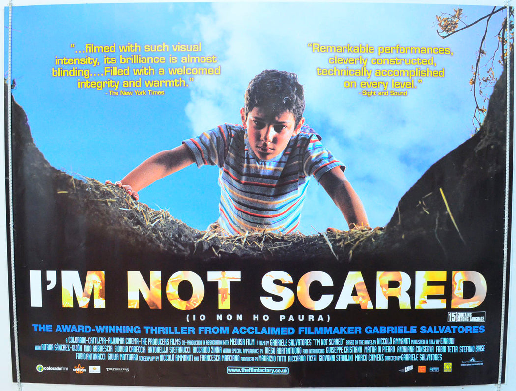
I’m Not Scared -
I think ‘I’m Not Scared’ implies to be about a boy facing his fears, and the film cover shows this clearly. The image of the boy standing at the edge of a dark hole creates an enigma code, suggesting mystery and something unknown. His posture and body language show fear but also curiosity, which hints at his internal struggle. The cinematography uses strong contrast such as behind him is bright lighting and a blue sky, symbolising innocence and safety, while in front of him it’s dull lighting like brown and black, connoting danger or secrecy. This visual contrast helps build tension and supports the mystery/thriller genre. The target audience is likely families or teens, as the theme appears to be bravery and somewhat seems like an educational film, but it also appeals to a niche audience who enjoy artistic films. The cover reflects its arthouse style, as it also isn’t a huge blockbuster Hollywood film, but a low budget film.
SinCity -
From the Sin City cover, the film looks like a dark crime thriller full of action and danger. The black-and-white colour scheme with the contrasting bold red typography adds a blood feel and violent imagery. The use of low-key lighting and heavy shadows builds a tense and mysterious atmosphere, making the mood feel threatening. The characters’ body language and serious facial expressions connotes that they’re ready for violence and conflict, which adds to the sense of danger. Their costumes being leather jackets, and sharp suits clearly establish character’s power and role in the film, whether them being a protagonist or antagonist. The mise-en-scene with the prop guns and postures also supports the idea of violence and tension. Overall, the enigma code created by the imagery makes the audience curious about the story, while the target audience seems to be older teens and adults who enjoy action and violent crime films.
Pirates of the Caribbean -
The Pirates of the Caribbean poster uses an intense orangish colour palette to create a fiery, dramatic atmosphere that connotes danger and excitement. The low-key lighting selectively highlights the protagonist, drawing focus to his serious facial expression, implying some conflict. The costume is very pirate vibes and the key props like a hat which clearly establishes his pirate identity, and the gun which confirms some action. The bold typography reinforces the rough, adventurous world of the film. The character’s confident body language and direct gaze create an enigma code that intrigues the audience. The large squid tentacles looming over the boat act as a powerful symbol of danger and the unknown, adding to the poster’s action code and creating tension. In addition, the background mise-en-scene with stormy clouds and hints of a ship supports the action code by revealing conflict and tension at sea. The target audience seems to be aimed for teens and adults, especially those who enjoy fantasy, action and adventure.
Bride and Prejudice -
The Bride and Prejudice poster seems to be a romantic comedy as it uses bright colours like blue and red to create a romantic and fun mood, which fits the genre. The high-key lighting makes the image look cheerful and happy. The typography is playful and stylish, showing the film may be aimed at teens, mostly female audience. The main characters are front and centre, wearing colourful formal costumes which fit the wedding vibe, which is part of the film’s themes. Their smiling faces and close body language create an action code of romance and friendship. The critics’ review saying the film is “spectacular, romantic, funny and SEXY” works as an endorsement, adding to the poster’s aim. The flowers and crowded background in the mise-en-scene also support the romantic and positive vibe.
Million Dollar Baby -
The Million Dollar Baby poster uses low-key lighting and a black-and-white colour scheme to create a dark, serious atmosphere, which fits the drama and sports genre. The strong lighting on the main character’s back and face highlights her strength and determination. The mise-en-scene includes boxing props like a sports outfit, clearly showing that the film is about boxing. The main character is turned away from the camera, with only part of her face showing, which creates an enigma code and makes the audience wonder about her story. The male characters in the background are placed slightly behind her, which could hint at their role in her journey. The bold, simple typography matches the serious tone of the film. The target audience seems to be for young adult.
.png)


Comments
Post a Comment